I’ve been working on the Drink•Eat•Walk logo a bunch the past few weeks. It’s getting closer to the feeling I’m trying to capture, but we’re still not there.
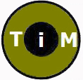
Let’s recap: The first D•E•W logo was created awhile ago by Copilot and me, where I prompted it with something like “create a circle logo for a food tour company in Washington, DC called Drink•Eat•Walk”:
It wasn’t great, but it had some interesting ideas within it. Definitely a strong start, though.
I created the next version of the logo from scratch in Figma. You can see my lack of skillz, and that it obviously came from the original logo, but I added the color palette I’d been thinking of, and I tried to simplify the imagery:
Better, but I hate it. One of the things I’m trying to convey in the logo is that this isn’t a gourmet foodie tour, nor filled with exotic cocktails, and will involve lots of purposeful walking. So, I chose each of the icons to, I guess, bring expectations down?
Anyway, the simplification of the center now makes it look like bad clip art, and is too literal. Also, the inclusion of the skyline goes against one of the prime directives of my tours — “No monuments & museums”. I like the circle & colors, though.
So, the imagery in the center is the issue. One thing I thought might work is to mimic the feeling of vintage Nation Park posters, and of modern patches & badges that have a simple, outdoorsy, western USA aesthetic, with warm colors & silhouettes:
At this point, I didn’t feel like I had the designer skillz to translate the story I want the logo to tell into a coherent illustration. So, I browsed Fiverr to see if there was anybody there that had done the kind of work I was looking for, and found someone who created a bunch of stuff like this:
The great thing about Fiverr is that you can get things created quickly at a very cheap price. I paid $43, gave some instructions, and received v1 within a couple of days:

I really liked the outer circle. That center, though. The downside of Fiverr is that you never really get what you were looking for or hoping for, especially in the first version. Luckily, the pricing includes a bunch of revisions.
So, I asked the designer to imagine a group walking up a city street of cafes, combined with the western-aesthetic stuff I mentioned above. After a few more back-and-forths, he came up with:

The outer circle is perfect. The center illustration is getting closer, but still definitely not there. The cafes look geometric & lifeless, the perspective is too sharp, and the people seem too numerous, small, & not of this era 🤣
At this point, I accepted delivery of the logo, despite knowing it wasn’t done yet. I just didn’t see him getting where I wanted to go.
So, I slapped the delivered logo into my Figma, and made a few tweaks: Meta AI and I created a more normal looking group, and I then added in some sunset coloring:
It now has more of the feel I’m looking for, I just hate those cafes, so I need to figure out to make them more of a plain black silhouette, but with enough detail to see that the cafes are alive.
We’re not done, but I can’t devote too much more time to the logo right now, as there are more important things I need to get to. So, this will have to be the logo for now, and it’s the one you’ll now see on the site, and in my social profiles. More Logo con’t posts to come.

Leave a comment